25

I’m Kurtis, senior product designer at Stack Exchange. First, I wanted to congratulate you because this site is now starting the process of moving out of beta to become a fully-graduated site! Well done!

Graduation and Your Site Design

Graduation comes with a few perks. We have already started your site's design, which will be a reflection of the site's subject and culture. This will help brand your site as unique, even while you share common elements with other sites as part a bigger Stack Exchange family.

Once the design goes up, you will receive a link in the footer of other sites in the network, along with the ability to migrate content to and from other sites — and the notoriety of a public launch that says, "Congratulations, you finally made it!"

Design Concept

For the design concept we wanted to create a geometric and mechanical feel and pulled abstract patterns from network charts.

Color scheme

The color scheme was inspired by common wire colors. We wanted it to feel technical with just a touch of uniqueness.

Color scheme swatches

Logo

Engineering complex networks is a task — We know things can get complicated, and network engineers are brilliant at taking that chaos and creating order from it. We wanted to create a logo that reflected this. The connections within the logo also represent the connections the community makes with each other. The favicon/site icon takes elements from the more complex wordmark but simplifies them.

Network Engineering logo concept

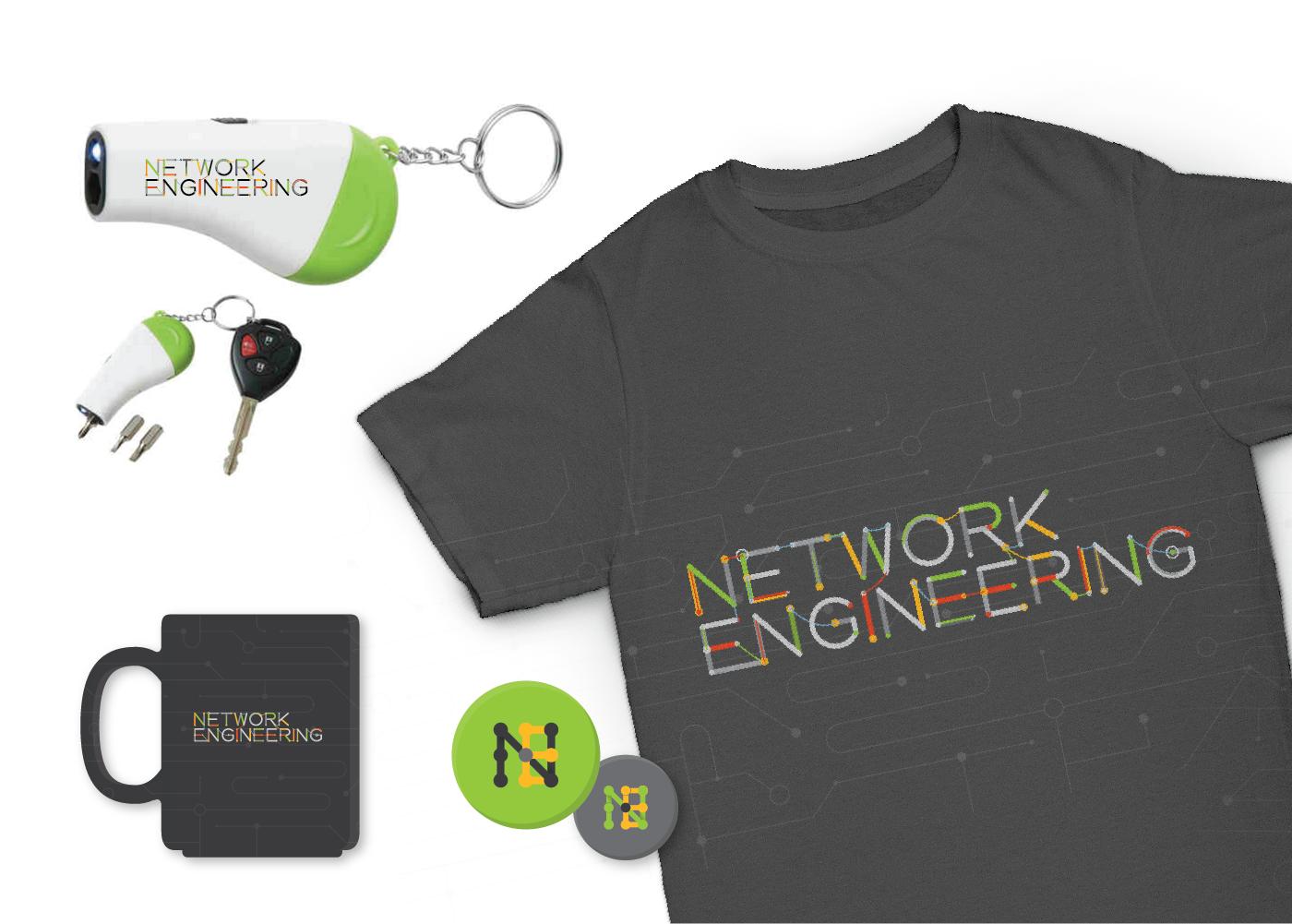
Swag

Swag

Stickers / coffee mug / t-shirt / flashlight & screwdriver combo keychain

Overall site design

Click image to view full-sized version.

Network Engineering home page enter image description here

After we receive and implement the community's feedback, we're just a few steps from finalizing all of the assets and publishing your new design!

Updates 06/05/2015

Thank you all for your feedback. We've heard your concerns with the first iteration of the design and have made some updates to the logo, color scheme, background pattern, and font.

For the logo, we decided to take the symbol for router and make that the main symbol. We also decided to adjust the background pattern based on the graphic you shared and toned down the colors. We will selectively integrate some monospace fonts in the final site.

enter image description here

17
  • 3
    really really minor nit: In the NE nine-dot-grid mini logo. The "E" doesn't jump out at me... did you try a comp with the lowest-right dot orange, and right-col-mid-heigh dot green? ...might make the "E" pop out better. Commented Apr 30, 2015 at 19:13
  • @CraigConstantine that's good feedback. Thanks!
    – Kurtis Beavers Staff
    Commented Apr 30, 2015 at 19:14
  • 3
    Probably just me, but the red for the vote up/down highlight bothers me a bit. In most management interfaces, my eyes track to the red as a potential problem so it seems a bit distracting. I am sure I will get used to it, but maybe something like amber as an alternative? Amber is a common color indicating link on many devices on modern equipment, but also can indicate shutdown/problem ports on network equipment. With both positive and negative connotations it works for both up and down votes. On the other hand, there are very good reasons why I let my wife do the home decor.
    – YLearn Mod
    Commented May 1, 2015 at 3:07
  • 1
    I think amber's a good call.
    – Kurtis Beavers Staff
    Commented May 1, 2015 at 11:29
  • 3
    Please use a monospace font like Courier New, no kidding it's what most of us will identify with Commented May 2, 2015 at 9:56
  • 3
    +1 for monospace. I spend much of my network admin time in putty and secureCRT. And somehow the console color scheme always ends up as green, yellow, or white on a black background.
    – alx9r
    Commented May 4, 2015 at 14:52
  • Again a nice work from you. Commented May 28, 2015 at 6:37
  • Doesn't the color scheme resemble the one at Chemistry SE too much? Commented Jun 3, 2015 at 6:22
  • 5
    I like the new design, just one nitpick again, could we get blue instead of green? :) Many of the visual icons for networking are blue and for me it would be more pleasing to the eye. Nevertheless the new design is a great improvement in my eyes. Commented Jun 5, 2015 at 21:23
  • 4
    I second @Sebastian, most networking symbols are blue and that seems to make more sense.
    – Ryan Foley
    Commented Jun 5, 2015 at 21:40
  • 1
    @Sebastian we can do blue if enough people really want it. To be hones, that's what we had at first, but so many other sites within the Stack Exchange network already use blue, so we were trying to add a little bit of uniqueness.
    – Kurtis Beavers Staff
    Commented Jun 5, 2015 at 22:38
  • I think the triangle vote buttons should have larger stroke width.
    – bjb568
    Commented Jun 7, 2015 at 19:06
  • 4
    Thank you for listening to our suggestions, @KurtisBeavers, I like the new design!
    – Teun Vink
    Commented Jun 8, 2015 at 13:52
  • 1
    Is it just me or does the routing symbol remind anyone else of the symbol for radioactivity? I think it's the green having this effect. Commented Jun 12, 2015 at 7:32
  • 4
    I'm actually out of the office this week. Thus the delayed response. I think blue will help make things not look radioactive. We'll make updates and launch soon.
    – Kurtis Beavers Staff
    Commented Jun 12, 2015 at 12:03

9 Answers 9

22

EDIT - 5 Jun 2015:

Thank you very much for an outstanding redesign. I un-downvoted, and like the following:

  • The router hockey-puck is a home run; great re-use of the puck as the letter "O". Simple. Jammin. Bravo.
  • Incorporating a network diagram into the background is a nice touch; although it's practically invisible with such a small image. I'm including a clickable image below for a better look...

click to see new NE banner

I have a few small quibbles:

  • Maybe these are just mock ups, but in case they are not: your coffee cup, t-shirt, and other swag are missing Stack Exchange branding / url. Please pump the site.
  • Could you give us a comparison of what the diagram in the banner looks like if you made the banner background lighter like the one on Graphic Design?
  • I have to say that I'm still a little underwhelmed with the existing green color. I get an icky feeling (for lack of a more appropriate adjective) when I look at it. I happen to be typing on my Debian laptop, and I use an xterm with 256 colors. Are you open to using the xterm-256 blue or red colors instead? This also would be a win because many network engineers love linux / OSX on our laptops. Maybe you could color "questions", "tags", "users", etc... in the same xterm colors (see below).

My xterm-256 window:
xterm 256 colors

Thanks again!


Original Post:
I'm sorry to say this, but I vote against the design.

  • The circuitboard-inspired font and background with dots joining lines has nothing to do with real network diagrams.
  • If you had not told us that the colors were pulled from cable colors, I would have never known. It's really too much; I especially dislike the color combination of the orange vote box and green accept.

If you want inspiration, take pictures of a 66-block, SC-fiber end, the page header from RFC 2328, a typical network diagram, people gathered around a white board, or maybe some Cisco / Juniper hockey-pucks. Another possibility, grab a photo of an old Cisco AGS+ (you know, the router that was Cisco's first "big iron").

This site is under constant pressure from people who are clueless about networks and many times need to ask on Super User. The existing design proposal does nothing to give them a hint that they are asking in the wrong place; worse still, the design does nothing to attract the real professionals we want to attract. Please give us something that harkens back to our professional network engineering experience.


End note: in the examples above, I intentionally went with "classic technology" so there would be less worry about the timelessness of the design. I'm trying to draw from the images that launched network engineering as a profession in the 1980s and 1990s.

5
  • 5
    A strong +1 on these remarks
    – Teun Vink
    Commented May 2, 2015 at 23:04
  • 7
    The logo reminds me more of an old-school telephone switchboard or something that Google is promoting than it does remind me of network engineering. When I think about network engineering I think about diagrams like these: juniper.net/techpubs/images/g037040.gif networkscreen.com/images/Wireless/WLA-Series/WLA-deployment.jpg Commented May 4, 2015 at 11:47
  • 4
    The style of the Cisco command references might also be a helpful inspiration. Something about their style is distinct enough that I can tell a page is part of a Cisco command reference at a glance.
    – alx9r
    Commented May 4, 2015 at 14:59
  • 5
    Thank you for the feedback. We're going to do a round of revisions to the proposed design and will post the results above.
    – Kurtis Beavers Staff
    Commented May 5, 2015 at 13:40
  • 3
    @KurtisBeavers, thank you... given that so many people use Cisco IOS here, a logo like this one: (config)# descr Network Engineering, where Network Engineering is emphasized to stand out looks good to me Commented May 8, 2015 at 2:09
7

Another backer to what Mike is saying; the current model doesn't accurately reflect the network engineering field. It seems too playful for the persona this stack is trying to give off.

Adding to the recommendations: we generally operated in a more abstract and theoretical model. Perhaps something like this might be something we can incorporate?

world internet depiction 1

world internet depiction 2

You may also try adding in some slick network diagram derived themes. This dude over at Network Diagram 101 is, in my opinion, an abolute wizz at this stuff and the place I normally go to construct network diagrams. Here's a few of the most impressive ones that pop out. Click to enlarge.

WAN diagram from networkdiagram101.com

LAN diagram from networkdiagram101.com

2
  • 2
    That's a great site! Thanks for the tip!
    – Ron Trunk
    Commented May 4, 2015 at 14:10
  • 1
    Thank you for the feedback. We're going to do a round of revisions to the proposed design and will post the results above.
    – Kurtis Beavers Staff
    Commented May 5, 2015 at 13:40
4

I agree completely with Mike. I have included some stock photos that also might serve as inspiration for a better logo and site design.

If I may suggest, focus less on wiring and other physical manifestations of networking. While that certainly is a part of what we do, much of our activity deals with conceptual networking ideas: traffic flow, routing, protocols, device configuration, design, and troubleshooting.

Instead of schematic diagrams that show physical wiring, we often use logical diagrams that show how logical constructs like VLANs, firewall zones, routing domains, etc. are interconnected. I think a design/logo that draws on those ideas would be instantly recognizable to networking professionals.

.

Network Image

Another network image

enter image description here

1
  • Thank you for the feedback. We're going to do a round of revisions to the proposed design and will post the results above.
    – Kurtis Beavers Staff
    Commented May 5, 2015 at 13:40
4

I actually like this design a lot, but I agree with the idea that the logo is not really inspired from network diagrams. I don't think I ever saw someone using curved thinner links (the ones linking the letters) in a network diagram. Maybe for representing console cables but that is very rare.

If you are seeking for inspiration on network diagrams, I really love the one Jeremy Stretch did when he used VSD Grafx stencils, like this one :

network diagram from packetlife

Jeremy is one of the people at the origin of this SE site, by the way. :)

As per the color scheme, it does not really remind me of cabling. What would remind me of cabling is either the inside of RJ45 cables (but, well, that color scheme is ugly..) or, because we are in 2015 after all, fibers patches such as these :

fiber patches

This image is missing an SC/APC connector that would be representative as well :

enter image description here

But on a purely aesthetic level, I love the color scheme you chose.

Finally, I love the right side of the header ("Questions --- Tags --- Users" etc.) That does remind me of a net diagram.

Many thanks for your work ! This site is going to be awesome.

4

I agree with Mike's feedback. While the logo is pretty, it doesn't quite reflect Network Engineering. I like the concept of the whiteboard network mapping. Might also want to do some very rigid, hierarchical, three layer diagrams. A few more images to add to the mix:

CLOS Fabrics, all the rage these days: CLOS Fabrics

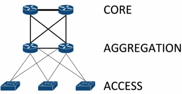
Defacto Network three layer design: Core/Aggregation/Access

Whiteboard Network Mapping: Whiteboard

2

I mean to take nothing away from those who have expressed concerns or alternative ideas. I even agree with them on some points to a degree, but I don't have a need to change the design personally. I don't think most adjustments or an entirely different design will make me any happier. For me, it is the functionality of the site that is more important to me than the design.

Admittedly, coming from the pit of crappy web management interfaces that I deal with on a regular basis in networking, my standards are pretty low. I am generally happy if an interface works as advertised and the fact that it doesn't look pretty is almost a forgone conclusion.

I don't concern myself too much with why a site chose certain colors, as long as they aren't too "jarring" to the eye or don't make it difficult to read. Would I have thought the color scheme was cabling derived? Probably not, but to be fair I probably wouldn't have given it much thought either.

It also probably isn't the palette of colors I would choose myself, but then neither are most of the rooms in my home (if you didn't catch it in my comment above, I leave design choices to my wife). I do however appreciate that the designers are attempting to tie the color scheme directly into the topic at hand rather than some random selection of colors they feel would look good.

I guess what all my rambling comes down to is that I do think the proposed design is much better than the "beta" design we have had for so long. I appreciate the time, thought and effort that has gone into the proposed design and I would be perfectly content with it as it stands. If it is a choice between going live with this next week and waiting for six months for an improved design, I would gladly go with this next week.

1

I agree completely with YLearn above. I think it's one of those things where, if there is a choice, I'd prefer a lot of the things that are being discussed above, but that doesn't actually mean the differences are that important or worth delaying anything for, in my opinion.

That said, if they're really shooting for authenticity, they should just encapsulate the whole thing as a gigantic, slow, buggy, terrible Java Applet that implements about 50% of the feature set and everyone would hate. Then they could throw together an SSH based BBS and we would just use that :).

Cisco SDN Interface

2
  • Terrible Java Applet it is ;)
    – Kurtis Beavers Staff
    Commented May 8, 2015 at 16:50
  • 2
    Don't forget that different parts of the site will require different versions of Java to be installed to run properly. Oh, and unsigned naturally so that they trip up modern Java security.
    – YLearn Mod
    Commented May 14, 2015 at 1:33
1

Bad design. Everybody knows that networking is about routing and switching as in :enter image description here

2
  • 1
    This is the same copy/paste as you provide on the non-meta site...
    – cpt_fink
    Commented Jun 4, 2015 at 3:13
  • .....hyperlink? Commented Jun 4, 2015 at 14:55
0

NE 5-layer icon and node network font How about a 5-layer icon and nodes shown in the word "network" except for the router icon. I took the radioactive-color green router icon presented earlier for the letter "o" though I'd prefer a different color for it. Another option would be to just have a router icon as the site's icon and remove it from the "network" word.

2
  • I like the thought, I'm just not sure the words "network engineering" stand out enough. Can the wire-art-graphic letters be modified to look a bit more like the letters they are trying to represent?
    – Eddie
    Commented Jun 15, 2015 at 20:23
  • Network Engineers have to be able to see the logical through the physical. ;-) Commented Jun 27, 2015 at 7:21

You must log in to answer this question.

Not the answer you're looking for? Browse other questions tagged .