Things are looking fairly generic right now, it will need some sprucing up before public release!
15 Answers
Maybe something based on the 7 layer stack of the OSI model? It is something network related, generic, supposed to model all aspects of network communications and furthermore it is an stack, what allows a logo related to other stack exchange sites.
-
Yes I like this also. The OSI stack is also fundamental in all network engineering so seems apt. Commented May 7, 2013 at 22:38
-
1I like it but I'm not sure if it can be compressed enough to still be usable as a small logo. Commented May 8, 2013 at 8:46
Keeping in the theme of StackOverflow and Serverfault. How about something like this?

-
1I do like this one.– user275Commented May 11, 2013 at 9:38
-
-
1...anyone else think it looks like a monitor with something vaguely resembling the Matrix trickle-down symbols? :^) Commented May 16, 2013 at 17:01
-
I thought it might look like that which is why I did the other design. I also tried flipping it around but I did like that look. And having some vague tie in to the Matrix isn't all bad...– PeterCommented May 17, 2013 at 10:50
-
I could vote for this one if we did a better job drawing the mod-plug... it took me about 10 seconds to realize that's supposed to be an EIA-568A pinned ethernet plug– Mike Pennington ModCommented Aug 15, 2013 at 1:55
-
First I am clearly not an artist - improvements welcome. I kinda like that it can be mistaken for a matrix scroll - deeper levels of meaning. (Also, that is a 568B pin-out if I'm not mistaken.)– PeterCommented Aug 19, 2013 at 13:02
Or a slightly different take, but still in keeping with StackOverflow and Serverfault feel:

How about a standard router symbol, something like this (probably a bit slicker looking):

well, "layer 5 and below" (5session, 4transport, 3network, 2datalink, 1physical) are all definitely fair game for NE. How about...
A stack of blocks showing the seven layers. The top two (7application, 6presentation) would be gray, so to be visually downplayed. The lower 5 blocks are then colored and labeled.
-
This would fit well with the whole Stack Exchange theme, IMO... Commented May 9, 2013 at 13:02
-
I can see that being a good fit, and being kind of like the Server Fault logo– BaldrickCommented May 19, 2013 at 21:05
I would suggest something that represents the stereotypical strife of a network engineer, or the scene they face every day. Maybe abstract IOS-like commands, or Cisco topology symbols in use?
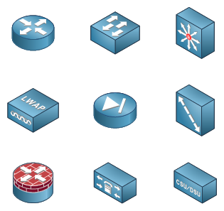
I do love the logo Jeremy uses for his blog, and I also love the visio stencils he uses :
I think our logo should be in the same spirit.

The logo should be a cloud. Then we can call it iNetworkEngineering, which means it will automatically sell millions!
-
Web Applications has a cloud logo cdn.sstatic.net/webapps/img/logo.png Commented May 8, 2013 at 7:39
-
@Sathya I think you overlooked the painful sarcasm from Keller Commented May 9, 2013 at 7:38
-
@SimonJGreen ay. My mind switched off after seeing the first sentence -.- Commented May 9, 2013 at 7:45
What do you guys think of a stack of hardware, such as switches and routers, as the logo?
-
1A stack of hardware might look too much like a stack of plain servers. Commented May 8, 2013 at 15:07
What about a graph reproducing very simple infrastructure? Not rather complicated things like figure 1 here, but more similar to this one drawn with TikZ.
This is one of the coolest images I've seen for a network analogy. It's a pipe in digital splendor. Not sure if this can be reduced and be useable, but perhaps this will spark inspiration for the network engineers we have here who moonlight as graphic designers.

Disclaimer: I used this on my own personal blog (and now as my profile pic).
-
Nice image, I agree, but who owns the copyright for the image? Maybe CHEQ-IT Ltd. in Calgary, Alberta? I dunno, I'm just sayin'... Commented May 20, 2013 at 7:03
-
Most of the images on my blog, including this one, comes from a royalty-free image site: sxc.hu Of course, I'm assuming the claims of the authors at this site own the images they upload. And the rest of my images of used with permission :-) Commented May 20, 2013 at 8:17
-
See ux.stackexchange.com's simple and elegant icon. Commented Aug 1, 2014 at 7:17
 Layer 8 icon.
Network Engineering is the 8th layer!
Here's my first stab at an icon, not explicitly showing NE as L8, but close enough to get the idea. Forgive my lack of graphic designing skills. This could be scaled-up for the larger logo.
This represents L1-L4 (PH-DL-Net-Transport) with Network Engineering sitting on top above the not shown L5-L7.
This is an .ico file converted to png since SE doesn't allow ico image uploads.
I like the idea of an abstract cable that has been accidentally cut with blocks representing packets slowly leaking out, similar in spirit to the Stack Overflow logo.

